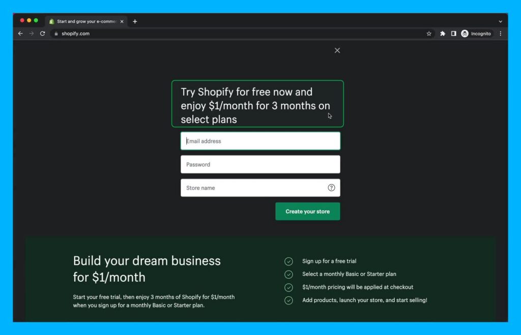
Your sign-up page can bottleneck your growth.
Here are 7 proven tips to increase your conversions:
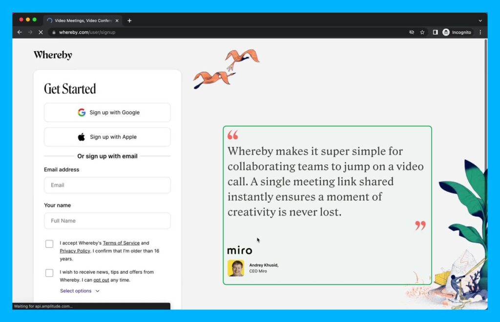
1) Use Testimonials
Testimonials allow a user to dream.
The user can see someone similar to them achieving their goal.
They just need to sign up.
Use testimonials from customers like Whereby.
Give your visitors the confidence your product can help them.
2) Keep it minimal
The more options, the more likely a user will leave.
Hick’s law: More options lead to harder decisions.
Don’t distract the user.
Don’t ask for fields you don’t need.
Don’t make them think.
Keep them focused on signing up.
3) Add personality
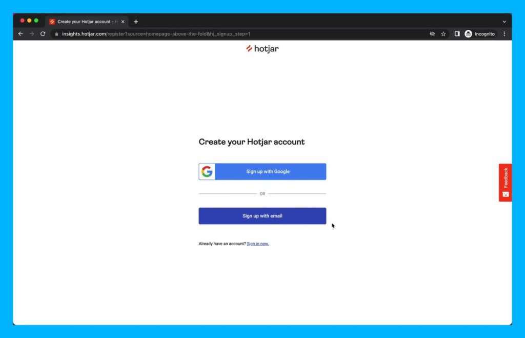
Your sign-up pages can have personality.
Behind the sign-up form is something potentially amazing.
So excite your users to sign up with the right imagery and design.
Waitwhile brings the vibes.
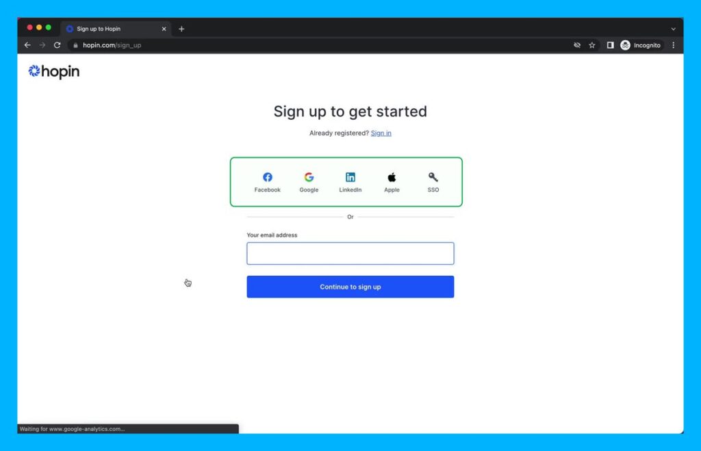
4) Use Social buttons
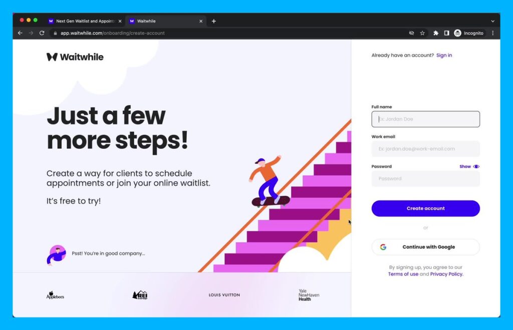
Large numbers of potential users drop off on the password screen.
Hotjar uses social login so you don’t have to create a password.
Leverage relevant social buttons to reduce friction for your users.
5) Reinforce value props
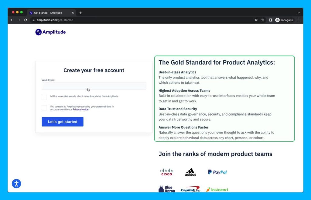
The sign-up page is a place where users have doubts.
Should I trust this company?
Will I get value?
Amplitude overcomes these objections with clear benefits.
They touch on trust.
And they use strong social proof by showing their customers.
6) Increase motivation
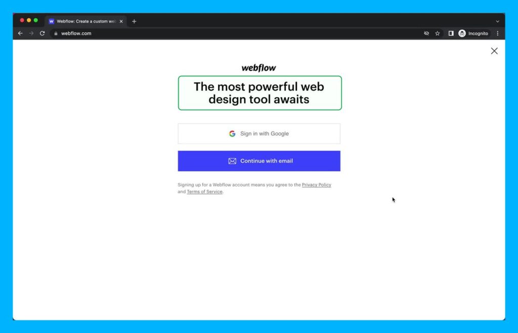
You can increase conversion by reducing friction or increasing motivation.
Use copy that excites the user.
Here, the reader may have heard about the wonders of Webflow.
This copy leans into that.
They create suspense.
7) A Strong Offer
A great offer will increase your sign-up rates.
Be clear about the benefits.
And make it one that is hard to resist.
Scarcity and urgency both work well.
As well as guarantees.
Shopify makes it easy to sign-up $1 / month offer after the free trial.
